An easier way for people to read ocean forecasts, find a beach to match their desires and ocean competency level, and ultimately understand the ocean.

Conduct competitive analysis, research and test local transit app, and survey local & non-local public transport users
Perform card sorting activities to determine information architecture in order to increase user experience.
Design a delightful experience based on the core features that users want and need most.

In our research, we wanted to understand how millennials feel about finances, and gain insight into what they do to set and achieve their financial goals.
1. What are the most common tools that millennials use to manage & grow in their finances?
2. Do millennials feel intimidated by the home buying process?
3. How do millenials grow their wealth?
4. Do millennials buy into what the older generation is saying about financial discipline?
Create a better way for people to learn the skill of reading ocean conditions and ultimately having more fun at the beach, wiser.
Create a way for people to learn about ocean conditions and beach safety in a quick and relevant way.
Create a way for people to learn about ocean conditions and beach safety in a quick and relevant way.
Design a way for people to discover time frames at beaches that have the conditions that match their desires.
Decrease the number of people entering the ocean in spots or conditions that are far to dangerous for their skill level.
Stats from research, and user research.


The need for beach safety education is clearly there, so in my research I set out to understand if people see the need to learn about ocean safety. I discovered their experiences through surveys and interviews, and then synthesized the data to inform the direction of this project.

Key Insight #1
People get into dangerous situations at the beach because they do not have the experience to perceive and understand changing ocean conditions.

Key Insight #2
People experience frustration while at the beach because they do not know how to pick the best beach location, or time frame for their desires.

Key Insight #3
People do not consider rips when they go to the beach because they do not know how they work, ignore signage, and in extreme cases, do not even know what rips are.

Key Insight #4
People do want to learn more about the ocean, but are busy, so they need a quick, relevant way to learn about ocean conditions and safety.

The forecasting apps that I studied are most useful for experienced beachgoers, like boaters, surfers and fishermen, who already understand what type of conditions are best for them and how to interpret the information.

The First Aid Fast App has a very simple goal- provide people with an easy way to respond to an emergency, with step by step, concise info.

Incredibly helpful for people to pick a trail best suited for them based on accessibility, activity type and experience level. Does not include very many details about beaches.
.png)
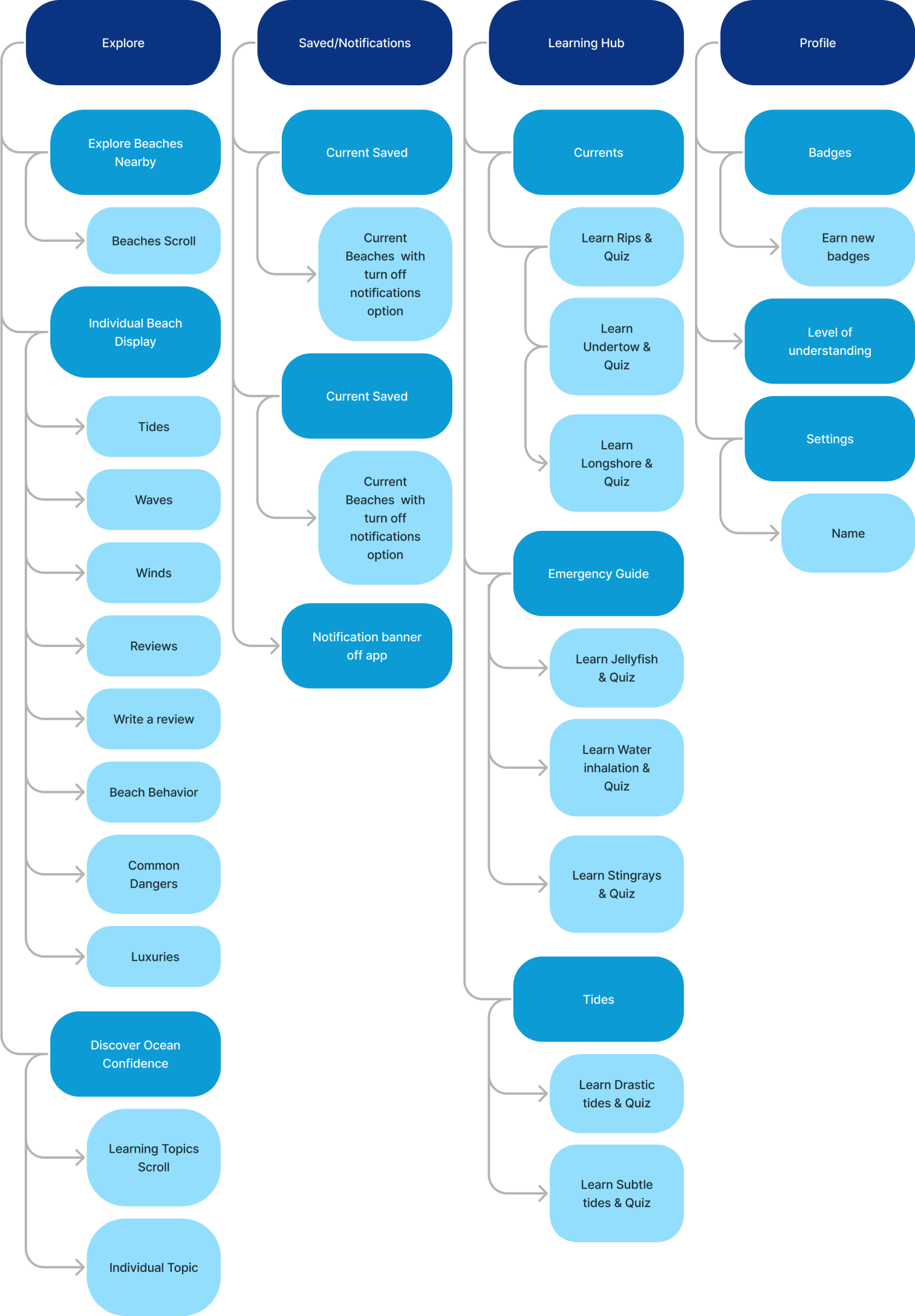
In order to create the best information architecture for an intuitive experience for our users, I needed to test the app categories by performing card sorting activities with 8 people. From there, I was able to create clear and intuitive site map and user flows.
User flows allowed me to test out and refine the flow through the core features, to ensure that each click a user will make is significant.
Goal #1
Eric wants to turn on notifications to start learning about the beach he wants to go to and be notified about changing conditions.

Tiffany discovers the learning center and badges through reading a beach’s current conditions.

Tiffany wants to share a hazard at the beach to help other moms.

Courtney finds a beach she wants to go to, turns on notifications and exits the app. When she gets notified about a condition change, she opens up the learning center to learn more and ends up earning a badge!

I iterated the site map on paper and in figma in order to create the ideal experience.

.png)
I designed mid fidelity wireframes in order to understand the user experience alone, without the added effects that color and UI has on our users such as emotion.
Up to this point in the project, I had been thinking and iterating the logo, colors, and typography. These are the choices that I made to guide the consistent interface and experience of the app and the brand of Beach Wise.
The Beach Wise logo encompasses the colors of shallow and deeper water of the ocean, allowing our users to imagine diving into deeper waters. The word “wise” with the wave breaking in the W, allows our users to recognize that becoming wise in the ocean is important. The ocean topographical lines show that there is more to the beach than what meets the eye.

The minimum viable product is a fun, educational and relevant app that empowers people to have more successful beach days. Every part of the app guides users to the learning center to learn about the beaches they go to, and the ocean in general, in a relevant way,
.png)
.png)
The main dashboard is an overview of each of the app’s core features that make up the minimum viable product:
- A link to all resources and articles
- A Free financial coaching offering
- The ability to search for a specific tip
- A newsfeed with encouraging stories
- The ability to share your own encouraging stories
- The community overview, so that the user can add new friends.
We will now go over each of these expanded core features. 30 mid fidelity wireframes were created.
%20(1).png)
One of the main things that will change millennials financial status and help them reach their goals is education. Our app features budgeting, credit, vehicle and home financing, and investment resources. Users can also save articles to easily find it later.


In our research we found that millennials can get overwhelmed by information, so we wanted to include an encouraging story of the day feature front and center, in order to highlight real people having real success by implementing tools that they learn through our app. Users can also create a post.


The app is free, and allows for a free 30 minutes clarity coaching session on finances. If the user decides they like coaching and want to continue, they are able to virtually book a financial coach/advisor to help them meet their specific goals.


Our research showed us that millennials don’t want to learn things the hard way, or the long way. A solution we came up with was to connect millennials in their financial stories to encourage and inspire each other. The newsfeed is designed to be a place where users scroll and can quickly skim through and digest other user’s stories, and the one minute quick reads.


Our app also hosts live streams once a month for users to ask questions, or to watch an expert interview. Users can access past recordings through the resources tab.


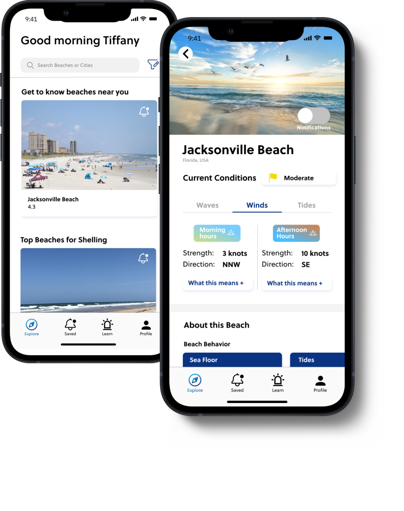
The home screen is the explore page, where users can scroll through beach options near them, search a beach or city, and apply filters by activity and preference type. They will also get their initial touch point with the learning hub, to “discover true ocean confidence”.


Users can learn about a single desired beach through scrolling through current conditions, learn what it means for that beach. They can also learn about consistencies at that beach such as sea floor, type of tide, etc. The luxuries section allow users to have a more satisfying experience at a beach by knowing which spot to choose for the extra essentials. The reviews give users real time data on what the beach is really like. A long term goal for Beach Wise is to have beach access information, not just general information about a 3 mile stretch of beach.
Users have the ability to save a beach that they want to be notified about for ocean condition changes. Notifications can easily be turned off and on in the “current” and “past” tabs. This feature allows users to get to know a beach’s behavior in preparation for a vacation to a beach, or to be notified of important changes while they are at that beach. The notifications are not just notifications like the weather app would give, they will be easier to understand through simple language. Users will have the the opportunity to learn more about ocean conditions in general in the learning hub through the notification.

Everything in the app guides the user to the learning hub. The ulitmate goal for our user is to become aware of the rhythms of the ocean, and the way the ocean works, so that they can approach any beach with the confidence to make an informed decision to get in the water or not, and achieve their goals for their time at the beach. The learning hub has various important topics that opens up to a video, or image with written information. Quizzes are the last step in the learning process, which allows for the information to stick, and for users to earn badges and get positive reinforcement.


Users will get to share what they did at the beach, report any hazards, and give additional information. If it makes sense in the future, a community aspect of the app will be added to encourage more reviews. The reviews give Beach Wise, and other users, the most accurate data about these beaches.


Gamification is a proven effective way to teach users a new skill. As users earn more badges through quizzes, their level of understanding will increase. Hawaiian terms were chosen for the levels of understanding. Each badge is clickable to bring a user to the learning page of that topic.
Bite sized, relevant education on the ocean condition that is changing will come with every notification. The notifications will help users get to know beaches before their trips, and while they are there. A common frustration for people is tidal changes and their items getting wet. Imagine if we not only told them when the tide was changing, but also gave them tips on seeing where the tide line is, and understanding how drastic of the tidal change at their beach is. How much more helpful that would be!
